Quick Reference
The repeating-linear-gradient() function is used to repeat linear gradients. See the linear-gradient() function for more details.
/* repeating linear gradient */
div {
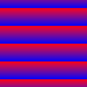
    background-image: repeating-linear-gradient(red 10%, blue 30%);
}
/* repeating conic gradient with defined color-starts and color-stops */
div {
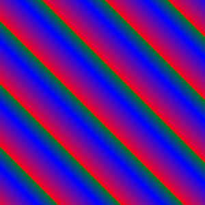
    background-image: repeating-linear-gradient(45deg, red, blue 10%, green 15%);
}
Syntax
repeating-linear-gradient(angle | to side-or-corner, color-stop1, color-stop2)Values
| Value | Description |
|---|---|
| angle | Defines an angle of direction for the gradient from 0deg to 360deg (default is 180deg) |
| side-or-corner | Defines the position of the starting-point of the gradient line; it consists of two keywords: the first one indicates the horizontal side, left or right, and the second one the vertical side, top or bottom |
| color-stop1, color-stop2,... | Color stops are the colors you want to render smooth transitions among; this value consists of a color value, followed by an optional stop position (a percentage between 0% and 100% or a length along the gradient axis) |
CSS Notes:
- The “inherit”, “initial” and “unset” keywords can be used with any CSS property to set its value
- In CSS there are many ways to express a color value in a property
We’d like to acknowledge that we learned a great deal of our coding from W3Schools and TutorialsPoint, borrowing heavily from their teaching process and excellent code examples. We highly recommend both sites to deepen your experience, and further your coding journey. We’re just hitting the basics here at 1SMARTchicken.
