
Quick Reference
The linear-gradient() function sets a linear gradient as the background image.
To create a linear gradient you define at least two color stops. You can also set a starting point and a direction (or an angle) along with the gradient effect.
/* three-color gradient */
div {
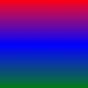
    background-image: linear-gradient(red, blue, green);
}
/* two-color gradient going left to right */
div {
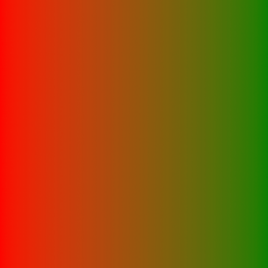
    background-image: linear-gradient(to right, red, green);
}
/* two-color gradient going top left to bottom right */
div {
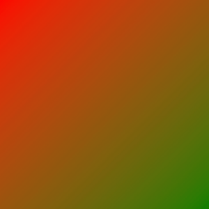
    background-image: linear-gradient(to bottom right, red, green);
}
/* two-color gradient with a specified angle */
div {
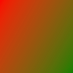
    background-image: linear-gradient(120deg, red, green);
}
/* two-color gradient going left to right with multiple color stops */
div {
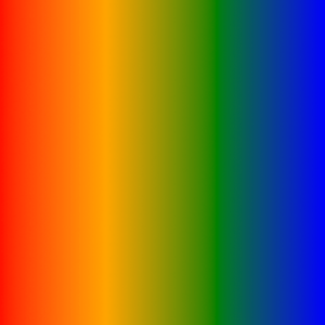
    background-image: linear-gradient(to right, red, orange, green, blue);
}
Syntax
linear-gradient(direction, color-stop1, color-stop2)Values
| Value | Description |
|---|---|
| direction | Defines a starting point and a direction (or an angle) along with the gradient effect |
| color-stop1, color-stop2, etc. | Color stops are the colors you want to render smooth transitions among; this value consists of a color value, followed by an optional stop position (a percentage between 0% and 100% or a length along the gradient axis) |
CSS Notes:
- The “inherit”, “initial” and “unset” keywords can be used with any CSS property to set its value
- In CSS there are many ways to express a color value in a property
We’d like to acknowledge that we learned a great deal of our coding from W3Schools and TutorialsPoint, borrowing heavily from their teaching process and excellent code examples. We highly recommend both sites to deepen your experience, and further your coding journey. We’re just hitting the basics here at 1SMARTchicken.
